thursdays mean letterpress, in my world.
each week’s fourth day I make my winding way by foot or brown line L train or–too often running late–car to the bull dog lock building set beside metra traintracks in shabby-glamorous ravenswood industrial corridor.
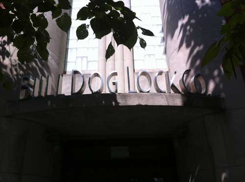
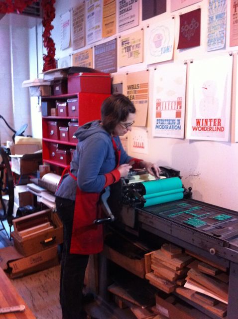
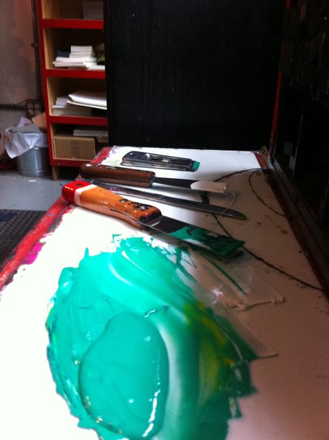
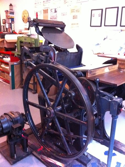
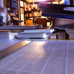
there inside one of several 1000-ft artist’s studios with great big warehouse windows printer, graphic designer, and proprietress of starshaped press jen farrell makes freshly old-timey magic with a pair of chandler & price standing floor platen presses, a moderately persnickety vandercook universal proof press for large format and linoleum cut work, a metric ton of lead, and an ever-expanding collection of vintage wooden type rescued from shuttered shops and collectors across the states.
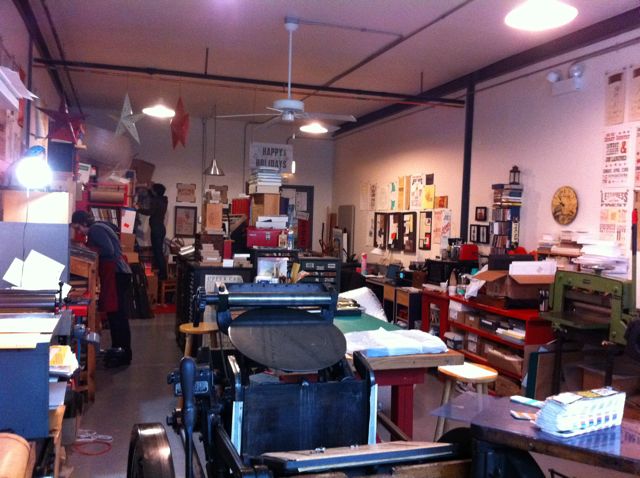 within this creative mecca I soak up inspiration in the company of women who very capably make things, run businesses of sane and clearcut vision, and direct their daily work outside the mainstream of chicago’s suited loop.
alongside jen works #1 intern sarah vogel, wizard with lino knives and recipient of an illinois arts grant, who teaches workshops at evanston print and paper shop.
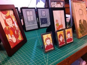
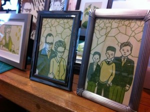
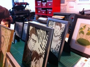
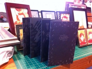
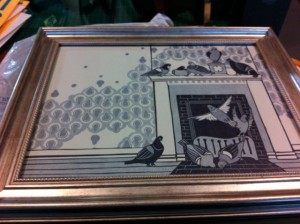
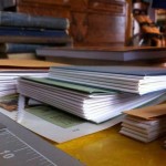
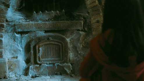
not long ago she brought in a bunch of prints she’d finished for boxing up and shipping off to a gallery show in denver, and I had the opportunity to grab some quick snaps. when I asked sarah about her work, she related to me a kind of mythic narrative about decaying domesticity. the collection is titled “Creep” and is slated for local display in evanston later this fall.
for my own part I’m one of a handful of one-day-a-week learning interns, trading time and manpower for hands-on practice with the gear.
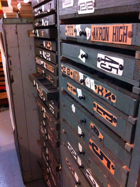
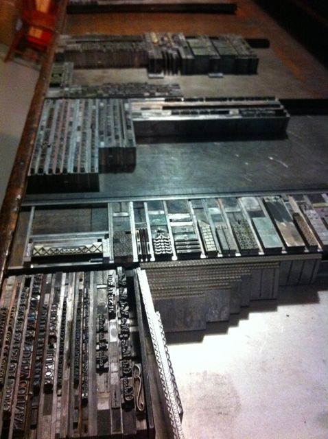 a lot of days there’s only scut work to be had– distributing lead type, tediously tiny some of it, sorting and labeling drawers of recent acquisitions– but, to be honest, there’s a meditative zen to be had in these repetitive manual processes, as, fingers black with lead, I zone out to a background of bollywood musical numbers and ’90’s alternative rock piped from jen’s ipod, muttering names to myself like typographer’s mantras: bernhard gothic, phenix, keynote, agency, elegante…
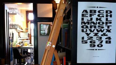
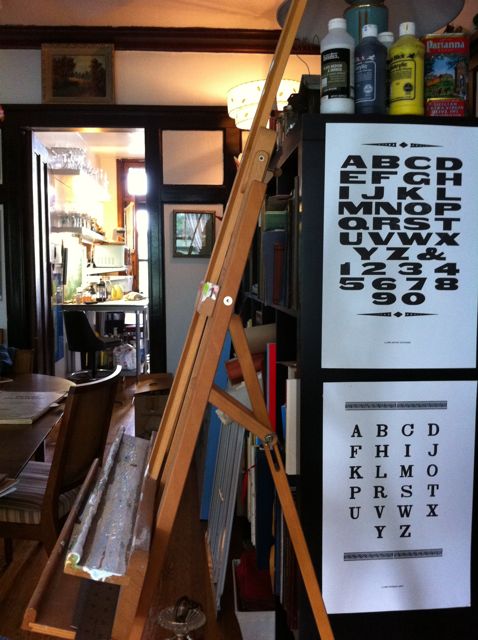 because it’s a concretely physical craft, wherein dings add character and evidence of handwork, letterpress printing necessarily entails this work I slightingly call “scut”–it’s an integral part of the process, perennial and grounding in refrain. occasionally, however, I get the chance to set up and print broadside sample specimens of jen’s wood typefaces and bring bits home with me, hang them up for inspiration until the next thursday comes around.
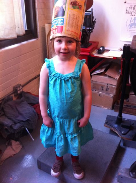 (this is josephine, a character)
other links:
Felt & Wire: Inside the studio: Starshaped Press
Chicagoist: Making posters at Starshaped Press
and a video by Chicago Revealed:
